AVOASIS
Coffee Branding, Packaging Design
AVOASIS began with a coffee bean successfully grown at Whittier College. To bring it to market, a coffee branding contest was opened for groups of one business-focused member and one designer. My partner, Ha My M. Pham, conducted market research and created the brand name “AVOASIS,” describing it as “The beans from a coffee & avocado vitality oasis.” As the designer, I developed a vibrant, organic visual identity to translate the aroma and taste of AVOASIS coffee into a visual aesthetic people can embrace.
Recognition: Distinction in Design Award (2nd Place)

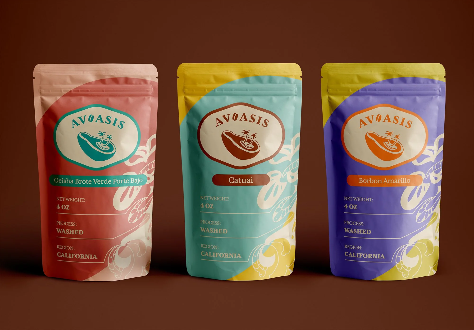
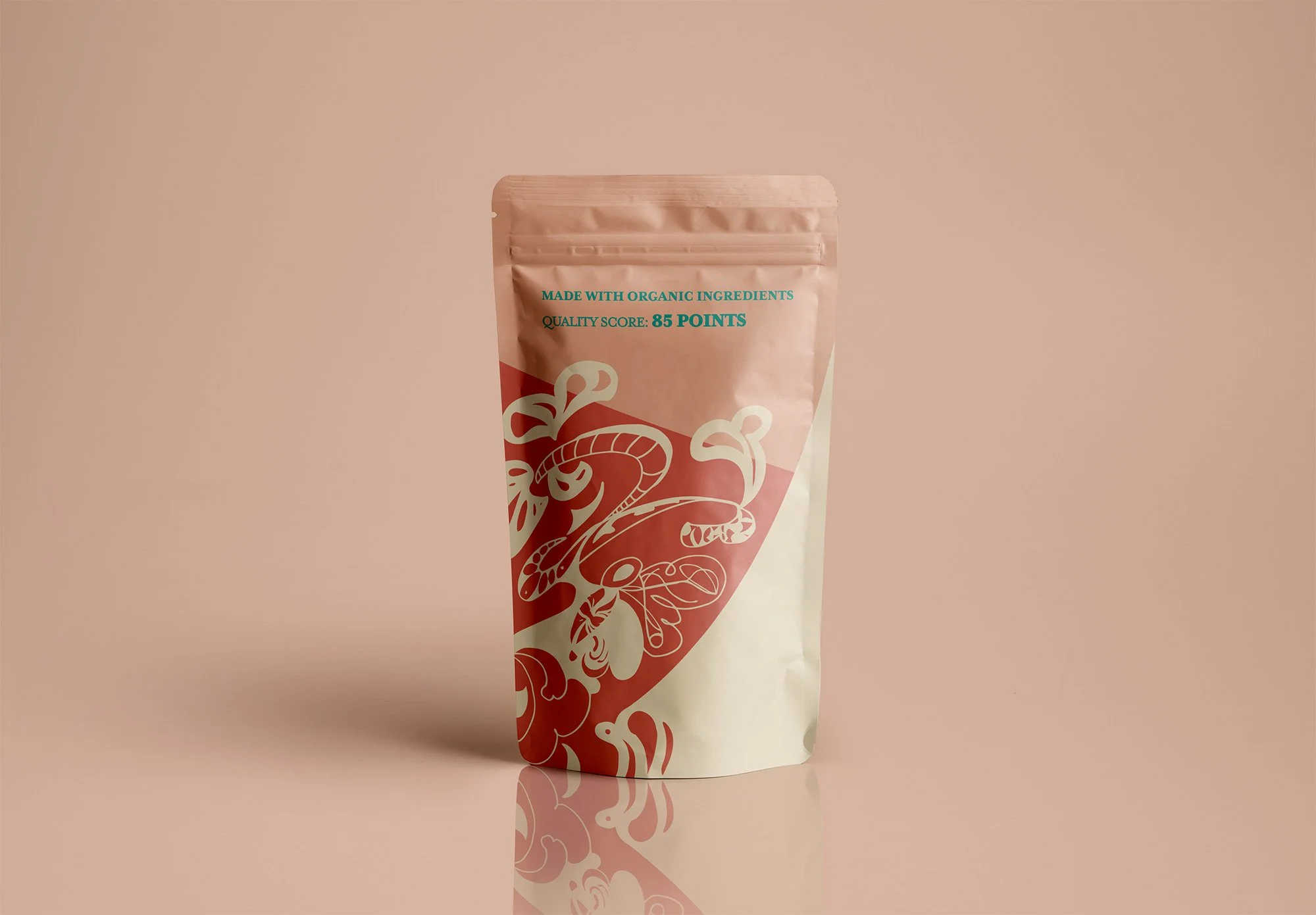

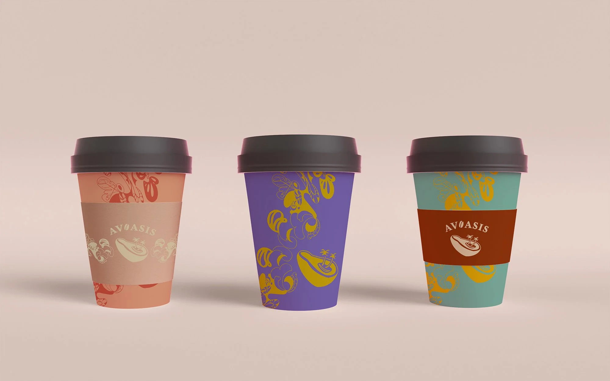
Designed to capture Whittier’s small-town charm and AVOASIS’s vibrant, organic identity, the coffee bean bags use distinct colors for each flavor while speaking the same visual language.
Flavor in Design
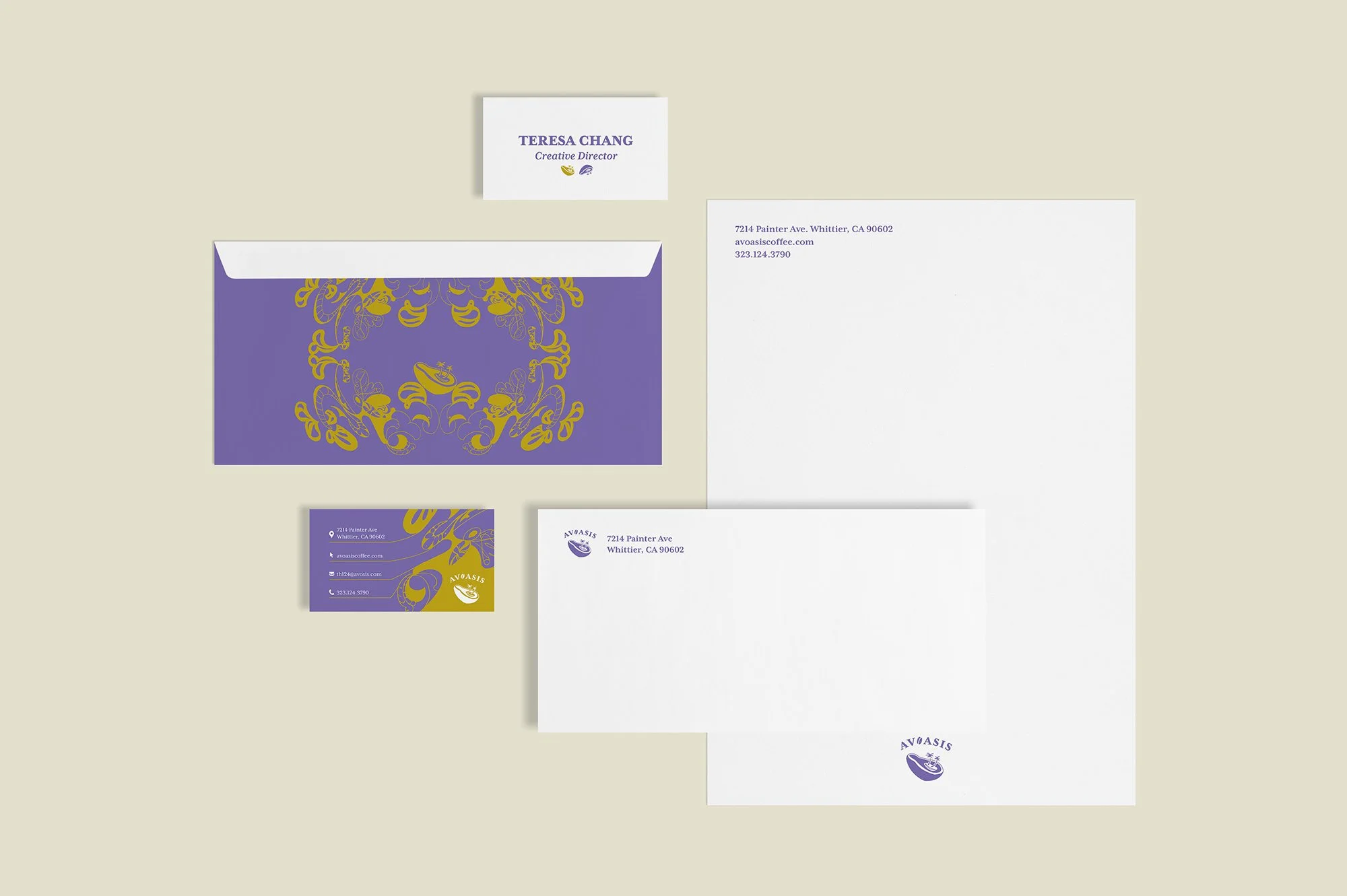

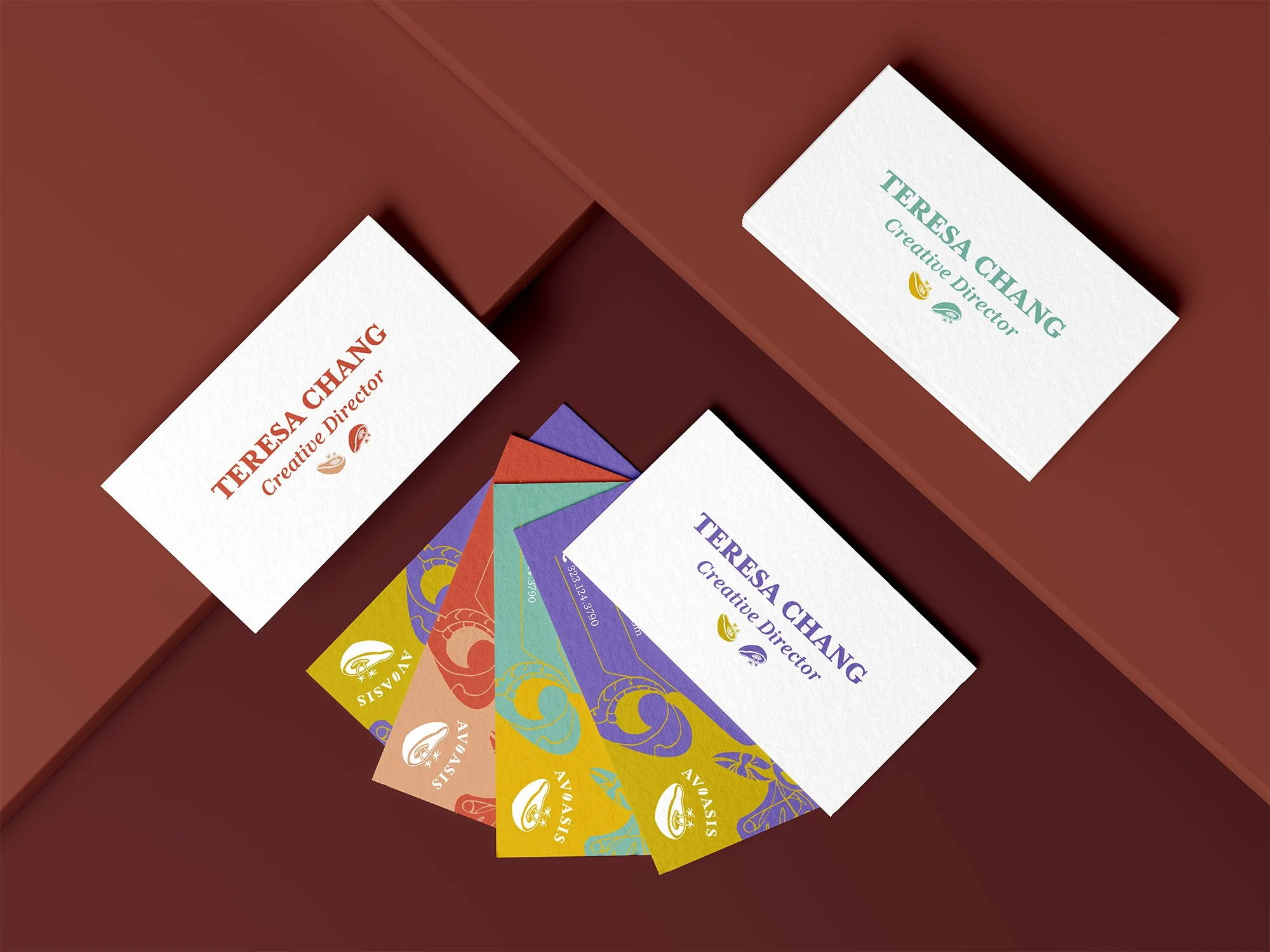
To ensure the brand language works across applications, the stationery set expands on the organic pattern I hand-drawn, while keeping colors consistent to maintain brand authenticity. Later, vibrant, varied color versions are applied solely to the business cards.