
Orba began with a vision: a clear, rational, and confident typeface with high legibility. This geometric grotesque typeface delivers function without distraction, making it ideal for 5–7 minute reading and giving content a clear, authoritative tone.
Font Design, Typography Design
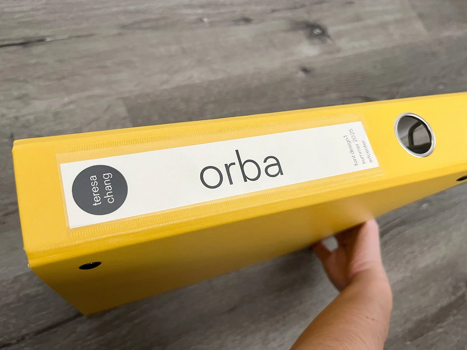
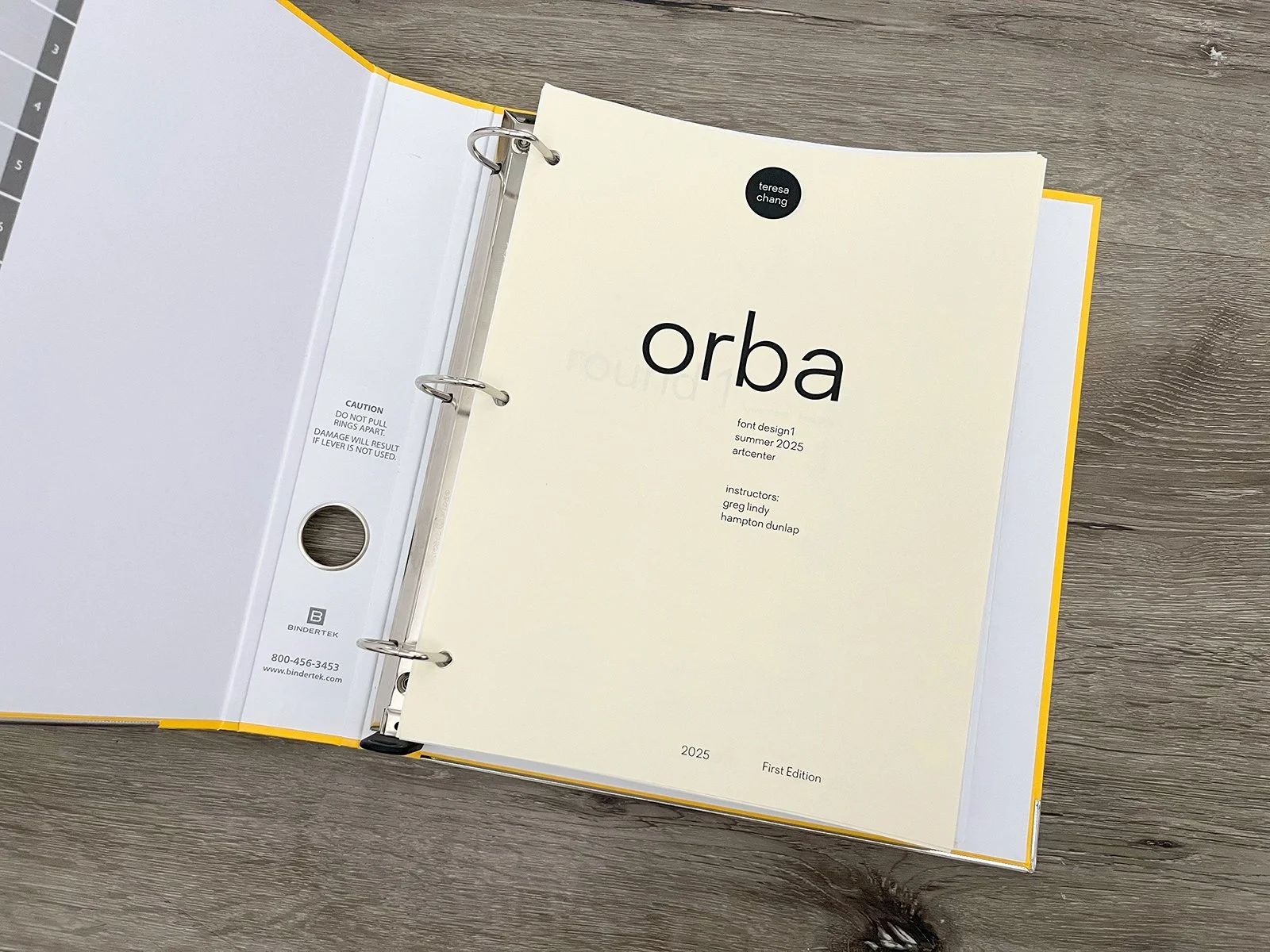
Orba

Refining the Typeface
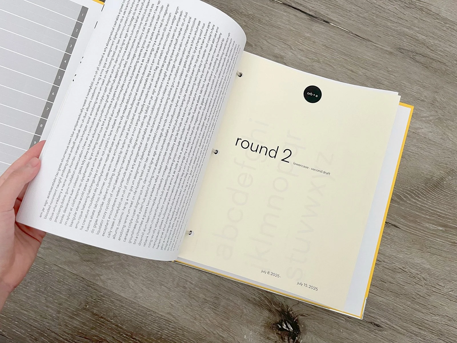
I intentionally documented each week’s progress to record the process and develop a designer’s eye for spotting any oddities or distractions in this rational typeface.

Two specimen posters were created for Orba’s first edition to showcase the typeface’s versatility—demonstrating readability at different sizes, lengths, and the kinds of content it presents best.